The LinkedIn Roast: Brutally honest profile fixes that attract clients
To view this video, please accept marketing cookies.
Posted: Wed 14th Oct 2026
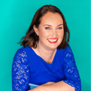
Jen Corcoran shows you what she looks for when she lands on a profile and how to fix the biggest first-impression problems.
Jen roasts five to 10 LinkedIn profiles. Attendees who volunteered got one to two practical tips they could use straight away.
Topics covered in this session
How to make it obvious what you do and who you help: We’ll look at your banner, headline and positioning and whether they make the right people stop and think: “This could be for me.”
What makes people trust you (or hesitate): You’ll see what I notice when I first land on a profile, including the things that build credibility and the small things that can create confusion
How to give profile visitors a reason to take the next step: We’ll look at how your profile can encourage the right people to connect, explore your content, enquire or book a call rather than simply telling them what you do
About the speaker
Jen is a multi-award-winning LinkedIn strategist and mentor on a mission to help driven midlife women in business toot their own horn with confidence and authenticity so they can create positive change in their own lives and in the world.
Her corporate client list includes industry giants like LinkedIn, Amazon, BT, London South Bank University, London Chamber of Commerce and the University of Exeter.
Watch more expert webinars
Access a growing collection of expert-led webinars covering marketing, sales, finance, growth and more – ready whenever you are.
Transcript
Lightly edited for clarity.
Ryan Tindall (host, Enterprise Nation): Good afternoon, everyone, and welcome to today's Lunch and Learn. My name is Ryan, and I'll be your host today. For those of you attending for the first time, Enterprise Nation is a vibrant business platform for start-ups and small businesses.
Today, I'm very pleased to introduce the brilliant Jen Corcoran, a LinkedIn strategist. In this session, Jen will show you what she looks for when she lands on a LinkedIn profile and how to fix the first big impression problems. This session is a little different: we have some profiles already submitted, and Jen is going to be doing a bit of a roast on them.
As always, post any questions in the chat and we'll do our best to answer them at the end. The webinar is recorded, so a follow-up email with the recording will go out later. On that note, I'll hand over to you, Jen.
Jen Corcoran: Thank you, Ryan. I'm excited to be here. And thank you so much to the brave volunteers who have given me their names. It's all going to be done with kindness, so there's no need to be scared.
If anyone's interested as I go along, and you wouldn't mind a roast, don't be shy about putting your profile URL in the chat and connecting with me. You can see me on the screen. Before I bring up the first person, I want to explain what I'm doing today.
We've only got 30 minutes, so I'm going to get five or six people up and spend three or four minutes on each. It's all to do with first impressions. A lot of people agonise about their About section on LinkedIn, and it is very important, but if you don't make a positive first impression at the top of your profile, people won't scroll down.
Grabbing people's attention when they land, and being super clear about what you do, who you can help and how you can help them, is so important. The focus of today's roast is messaging, branding and positioning. On the face of it, people can have a well-optimised profile, and perhaps some of you have written yours with AI, but when you look at it, it's not clear.
A lot of people on LinkedIn try to be clever, and you look at their profile and think, "What the hell do you do? I have no clue." Everything comes back to your profile. Whether you're sending a connection request or a DM, sharing content or commenting, people will click on your profile, and if it lets you down, you may lose valuable opportunities.
Your profile is working for you 24/7. It is the ultimate content, which is why I wanted to come on today and help you with those first impressions. I'm going to bring up one of my lovely volunteers: today we've got Abby, Francesca, Samantha, Philippa, Anthony and Lorraine.
I'm probably going to touch on a few different parts of the profile. There are over 30 touchpoints on a LinkedIn profile, and for each of you I'll probably only touch on two. As I said, it's that first impression.
I'm going to bring up lovely Francesca, because we were chatting earlier in the comments. When I look at a profile, I'm always looking for whether it's clear what the person does. I'm not looking so much at visibility or whether it's all optimised.
I always look at a profile on both desktop and mobile, and I would urge you all to do the same. Something can be much clearer when it's big on the screen, but disappear on the mobile app. I'll talk about positives as well as I click on these.
So I'm going to look at your banner, your headline and, as an extra tip, your headshot. Your headshot is a lovely picture of you slightly to the side, and I would centre it a bit more. It's perfect in the sense that it's head, neck and shoulders; you look friendly and you're looking straight at the camera.
To really make it pop with your brand, Francesca, you might want to consider having a colour right behind you, like on my profile, because yours is a little busy with the leaves and everything. One colour from your brand would make it really stand out. It is a lovely photo; I'd just like to see it centred a little.
I want to stay on a positive note so people aren't afraid. But when I look at your banner and the start of your headline, I am confused. There is good stuff in your headline, but I think we need to tweak it.
We have to think of it like Ronseal, the varnish and the paint: we need to say what you do on the tin. When people look at your headline and banner, they should know who you are, who you help and how you can help them. I'm going to start with your headline.
A lot of people do this, Francesca – it's not just you. They try to be clever and put in little phrases, for example, "Chief Creator of Language Magic". I'm still not quite sure what that means, so I would start by saying that you are a translation and copywriting expert.
That's what I put at the start, because anytime you show up in a search or comment, people will only see the first 40 characters. You don't want something vague like "Chief Creator of Language Magic" – what if they don't even see the "magic"? They don't know what you do, so we want to lead with "translation and copywriting expert".
I might put the "dash of marketing sparkle" at the end. Personally, for you, I would write "translation and copywriting expert for premium hotels, museums and brands looking to captivate their audience". I think I'd keep that, but I would delete what comes after "discreet" and after "meticulous".
At the end, you can have a proof point. If you feel that being ISO qualified is really important within your industry, I would absolutely leave it there. You've got 220 characters for your headline; you don't have to use them all, but being clearer will help.
You've got a translation and copywriting expert for those you help, and you're helping them to captivate their audience. I think that would be a far better headline for you. Then we want that to carry through into your banner, because at the moment, when I look at it, I get confused.
I would take off a lot of the stuff here. The transcreation, translation and copywriting are amazing, so I would have those in bold, because that's what you should lead with. Underneath, I'd have "for premium hotels, museums and brands" – that's it.
The 600-plus satisfied clients is great, and I'd probably put that at the end of your headline as another proof point alongside the ISO qualification. The rest I would absolutely delete, and I'd probably use a different, plainer image. I don't think you need the email on the screen either, or phrases like "demand a comms strategy that gets results".
I'd just like to see "transcreation, translation, copywriting" in big, bold text, and then "premium hotels, museums, brands", because people will self-identify and think, "She can help me." So that is the first person, and hopefully that wasn't too traumatic for you.
Samantha is quite different, as she has a lot less in her banner. I actually love the simplicity of your name, your logo and "life coach". The only thing missing for me is "for who?" – I'd love to know "life coach for ***".
That's actually a really good banner, because it's clear and to the point, and people will go, "Yep, that's me." A lot of people try to throw the kitchen sink at their banner, and sometimes less is more. We just need to know for whom.
I'm a big believer in a professional headshot, so if you can have one done, I would say do it, as it helps you stand out. If not, you can get creative on something like Canva: load up an image like Samantha's and put a different background on it so it looks a bit more professional. Ideally, you want to be looking straight at the camera on LinkedIn.
It's all to do with know, like and trust, so people can see the whites of your eyes. Images where you're looking off to the right, left, up or down can be good for your banner, but for your headshot I'd have one like Francesca's, looking straight at the person. That's a tip for everyone.
Regarding the headline, we don't need to put in our company name unless it's a big brand like Enterprise Nation, Facebook or LinkedIn, because we're wasting characters. You say "certified insight coach" in the headline and "life coach" on the banner, and I try to keep it uniform. If life coach is the main title, that's what I'd put here.
What's missing for me is who you help and the result of working with you. If they get life coaching with you, what tangible or intangible benefit do they walk away with? Just to mix it up, and I'm not picking on anyone in particular, I'm going to click into Samantha's contact information.
A lot of people on LinkedIn have great banners, images and copy, and then you try to contact them, and there's no email, or no up-to-date email. If this is your up-to-date email, brilliant; if not, make sure it is. I work with a lot of people who have Gmail, Yahoo or Hotmail accounts that they hardly ever check, and they're missing a trick.
I like that you have an email and a mobile number in there – that's brilliant. One thing to look at at the top is Samantha's URL. I noticed that all of the volunteers could do with improving their profile link, because ideally you want to get rid of the numbers and digits at the end.
That way, anytime you share it, it looks professional and branded, and it can start a conversation. For you, Samantha, you could easily have "samantha-hobbs-life-coach", so people think, "Oh, you're a life coach – what is that?" rather than seeing those digits. That's just an extra tip for you.
Hopefully everybody watching today will go away with some tips as well. There are 30-plus touchpoints on your profile, but people won't scroll down if you're making it hard for them. You have to make it easy.
Let's bring up Philippa. If any of you have a website, you'll know about "above the fold" at the top of your site, and that's what I'm doing today with your profiles: the very top. I like Philippa's headshot looking straight to camera.
Again, I might change the background to a uniform brand colour, but she has good eye contact and looks friendly, which makes sense because she is a networking expert. The banner confuses me, though. If I didn't know what Philippa did, I would just see a few people sitting around laughing and joking, and I wouldn't know whether it was networking, an event or something else.
Adding some text would be great. You could keep the image but make it a lot smaller, and put "business networking expert" at the top, along with your logo, We Mean Biz. Then it all makes sense and ties in, and you think, "Oh yes, the networking" – just a few words to explain who you are when people land on your profile.
The name is looking good. I can see you're in Bristol, and I'd love to know where the networking communities are. I would spell that out, whether it's Bristol-based, a UK network, an online network or both.
Women Mean Biz is a network for women, which is great, while We Mean Biz is obviously mixed. I'd probably tweak your headline slightly, too. For the trainer and speaker part, I'd love to know who you train and what your speaking topics are, as that could be something you do separately from the networking.
When it comes to networking, I definitely want to know where you are and whether it's virtual or in person. Looking quickly here, this seems like a great business email, and she's got loads of links in here. Again, Philippa could tweak her URL to have "networking-expert" at the end, so that's a quickie for Philippa.
Now let's go for Anthony – we've only got one man here. There's a lot of text on the banner, which is why I suggest people look at their profile on mobile as well, where it becomes much smaller and harder to read. When you're positioning your messaging, think like a copywriter and take out words.
We don't need to put everything on the banner. The point of the top of your profile is to create a bit of intrigue so that people take action, and that action could simply be connecting with you or responding to your DM. We can share what we do through our content and the rest of our profile, so we don't need to throw the kitchen sink at it.
I have a few different things to tell Anthony. I'm going to start with the name: Anthony has "Anthony (voiced by Ant) Houston". I would delete the "voiced by Ant" – and it's very boring, but LinkedIn's terms and conditions don't allow anything in that field other than your name or qualifications such as a BA or MBA.
Anything brand-related, like "voiced by Ant", isn't allowed, and you risk your account being shut down without notice. I totally get that it's your brand name, as I can see you've got a lovely company page and it's on your banner. I wouldn't worry, because it is visible in other sections, so you really don't need it in your name.
I've also noticed over the last few years, since the pandemic, that people with things like that in their name can put people off connecting, because they feel they're going to be pitched to or sold to straight away. So I would just lead with your name in that section. There's a lot of information in the banner, but let me have a quick look in here as well.
A good thing to note from Anthony's contact section is that he's got his address. You don't have to list your full address if you're wondering whether you need to; you can just put your county, or if you work virtually, that's absolutely fine too. This all looks really good, but I would definitely put "voice-actor" at the end of your URL.
If we tweak the headline, that will help us tweak the banner. A quick one for the banner: I would absolutely delete "a joy to work with". It's really nice, but I wouldn't have it there.
I'll probably delete the image as well, because I don't think it really sells what you do. Definitely less is more, so I'd have a much plainer banner. I know I'm going off on tangents trying to do two things at once, but I would just lead with "Voiced by Ant".
I like the picture of you, and I like you pointing at certain things, which could be enough on its own. But definitely delete the stuff on the left and the image in the middle, as it's too distracting. When I look at your headline, I'll do lots of tweaking.
I would lead with "voice actor for TV, film, ad, audio and games" – literally what you do on the tin. For the awards and finalist listings, I'd maybe have "multi-award-winning" at the end, as I don't think you need to list all of them. Then something like: "I help games producers, creatives and directors with voice-over that connects, convinces and compels."
Don't worry about the Quavers. I've recently eaten some as well, but I don't think you need them. I know it's personality, and that's great, but you've got a headline that is interesting anyway and creates personality.
I'd make your banner simpler: just the logo, you and the text. I'd have "TV, film, ad, audio", and then below it "for games producers, creators and directors" – that's it. Less is more, definitely, because there's a lot there.
My advice for a headshot is always head, neck and shoulders, so zoom out slightly. I don't think you need your logo in your headshot either. A picture of you a little further back, and we're looking good to go.
Let's bring up Lorraine. I love that you've all connected with me in advance, and I hope it doesn't feel scary – I promise to be nice. Lorraine has a really good headshot: head, neck and shoulders, looking straight at the camera and friendly, with nice branded colours.
On the banner, it's a bit like Anthony's: whoa, there's a lot of text here, and I think a lot of it needs to go. What's your main messaging? I don't think you need any of the graphics.
I do love them, Lorraine, and I think they can absolutely be shared in content, but I wouldn't put them on the banner because they're quite small and hard to read. I would delete all the images and just make your text bigger, as you're repeating yourself with the graphics and the text. Less is more.
I need to look at your headline to make sure it all ties in. When I had a sneak peek a few days ago, I had to scroll down to find out more, which isn't a good thing, because you want it to be clear from the off what you do. The MCIPD relates to accreditation, so I definitely wouldn't lead with that.
You might be able to put it in your name, which is fine, or at the very end if you think it's important to your customers. I'd rather lead with "Head of HR", which shows who you are, or say you're open to head of HR, head of people or HR director roles. Or you might want to say you're a fractional HR expert.
"Building people functions from zero to one" is confusing to me. So my main advice stands: think about who you are title-wise, who you help and how you help them. Let's lead with "HR expert" or "fractional HR expert".
The things in your banner – people strategy and operations, leadership and transformation, governance and compliance, sustainability and impact – are all really good keywords that could make their way down into your headline. I need a bit more time to figure out the best headline for you. At the moment, I'd be thinking about who you help, so something like "fractional HR expert for x x x", followed by "helping x x x with people strategy and operations, governance and compliance, sustainability and impact".
You could have all of that in your headline, so definitely less on the banner and more in the headline. Having a quick look here, you could also tweak your URL to include "HR expert" or "fractional HR expert". You should definitely add an email or phone number here, because so many people on their profiles say things like "DM me".
I'm like, what if they're not already connected to you? You're making people jump through hoops. Don't be shy about putting your information in quite a few places: you might have it at the end of your About section, but what if somebody only looks at the start and wants to get in touch straight away? Definitely add some info here.
That is Lorraine, and we have one last person: Abby. I know this is fast and furious, so don't be shy about reaching out and connecting. I do remember this profile, and I remember being a bit confused and having to read on.
This is a common thing I see from very clever people, and you're all clever – all the volunteers I've spotlighted today are experts. I think people overthink LinkedIn: they put on their professional, formal mask and end up confusing their audience. From the banner image, I can see that you do some kind of community events.
I could also see "true making, not meetings" on the banner. I know your company is called Triathlon, but I was still completely confused and needed to read on. You could absolutely have your logo in the banner.
I would delete the [unclear] line but keep "Triathlon", and I think we need another line in the banner that makes everything make sense and link together. This is the thing: we can all be so close to our own businesses, because we're in the jar looking out, that we know exactly what we do, who we help and how we help them. We take for granted that it's clear, and it's not always clear at all, which is why it's good to have another pair of eyes.
So I'm slightly confused and need more information for the banner. When it came to the headline, I was still confused and needed to read on. "Bridging the gap between people, ideas and actions" – I like that sentence, but I still don't know who you are, who you help or what you do.
For the headline formula, you've got the end of it, but I don't know enough without reading further into your profile. I'm going to have a quick look in here. Your email looks great and your website's great.
Again, you can tweak your profile URL at the top to explain what Try It On Studios does. If people look at mine, my URL is not great, and I'll hold my hands up. I would love to have "jen-corcoran-linkedin-strategist", but LinkedIn are slightly mean and won't allow anyone to have "LinkedIn" in their URL, so I use my company name instead, but it's not great.
So always be super clear about what you do. If you're a photographer or a copywriter, put that in; you don't need your company name, you just need to be clear. We want to get rid of all those digits and numbers.
I need more information from Abby, so I'm going to scroll down. From the first line or so of your About section, you get a bit more information. I definitely think you need to take some of what you have below and put it into your headline.
You don't need to have "Try It On" or the company name. Just think about what your title is when people type into search, and which keywords they're going to use. Then think about who you help, and the "bridging the gap between people, ideas and actions" line will all tie in.
On the positive, I think the banner is almost there. We just need a tiny bit of text at the top that explains "true making, not meetings"; then it will all tie in. The image is great, your headshot's nice and you're looking straight at the camera, though you could change the background to a brand colour.
Your name looks great, and you've got your PhD. Anyone with qualifications can put them in their name, and the same goes for a maiden name if you've been married before. There are lots of positives, but I was left confused, and that's the thing: we want to be clear versus clever.
I think so many people try to be clever on LinkedIn and end up confusing people. So that's it, I think that's me. I know we've slightly gone on, Ryan, so I don't know if you have any more feedback.
Ryan: Thank you, Jen, that was brilliant and so helpful. I really enjoyed it, and it was so good to see people going back and forth in the chat and sharing their LinkedIn profiles. I know we don't have enough time to go through all of the profiles, but I would really encourage anyone to reach out to Jen afterwards.
I've popped your links in the chat, and there was some really good feedback. We'll do a quick question before we go, which is for Jen from Alicia. They asked: if you're juggling a full-time job and career and also pre-launching a start-up, how would you differentiate the requirements in your LinkedIn profile?
Jen: I get it: if you're an employee, you're kind of going under the radar. For you, the main approach is going to be in the DMs and the back end. One thing you can do now is create a separate company page.
When people connect with you, they'll see that you're an employee and work here, but they'll also see your business underneath in your experience section. You can start to share content on your company page as well. I would mainly be working in DMs and connection requests.
When you connect with people, explain, "I work for so-and-so, but I'm also doing my start-up." You might as well add that to your experience, so don't worry too much for now. I did a resource for Enterprise Nation, a checklist on how to set up a company page, so reach out to me or Google it.
If you go onto Enterprise Nation and click on my profile, you'll see the resources and webinars I've already done. They'll show you how to create a company page. I know initially a lot of people think, "Oh god, I have to make something else," but I promise it's a lot easier than creating a profile.
Ryan: Amazing, that's really good advice, Jen. I really encourage everyone to go to Jen's profile on the platform, where there are lots of resources and past sessions. A really big thank you, Jen – it has been a great session, and we definitely need to do another one of these.
Jen: I'd love to do another one. Seriously, a lot of people are saying they want to do it now that they've seen what I do. I will absolutely do another one, and I could mix it up and cover different parts of the profile.
I hope I've hammered home that it's so important to start from the top down, because a lot of us think we're clear and visible. On the face of it, we might look like we've got an okay profile, but when you delve deeper, it's not clear at all.
Ryan: Absolutely, and it's good to have a second pair of eyes looking at it, isn't it? Thank you so much – that was a brilliant session. Everyone on the call, please do connect with Jen afterwards.
The recording will go out later today, so keep an eye out for it. Thank you for joining, and a big thank you to Jen for a really good session.
Jen: Thank you, it was fun. I could roast people all day.
Ryan: Always with love. Until next time, then. Take care, everyone, and thanks, Jen.
Jen: Thanks, everyone. Bye-bye.
Explore our webinar library
Unlock more on-demand sessions designed to help you sharpen your skills, grow your business and stay one step ahead. Find more Lunch and Learn webinars